

Sonic North
Introduction
Sonic North is a startup media company. For the past two years, they offered a free platform to grow their user base and work out the bugs in their MVP. Since launching, they have significantly grown and are preparing to launch a freemium product to offer subscribers a more robust product and earn a stable revenue stream for their continued growth. The product has been well received and has a healthy user base of free users. They now need to design an experience that will allow users subscribe to a premium service for a monthly fee.
Constraints
Current signup flow has no call to action to subscribe upon registration
Existing user flow has no prominent calls to action in the the free app experience to subscribe to a premium experience.
Roles and Responsibilities
UI Designer
User Research
Usability Testing
Project Plan
Discovery Phase
Research
I wanted to learn which features were premium and standard in similar products. I asked three questions to learn this:

Heuristic Analysis
To answer these three questions, I completed a competitive heuristic analysis of three competitors. I looked at Musi-a new and growing company, Pandora-an established company, and Spotify-the industry leader. I graded each company’s product based on how well it matched real-world systems, maintained consistency, and kept an aesthetic and minimalistic design throughout their systems. I rated each based on a 4-point scale. Below are some crucial findings which I made sure to address in my own design.
-
Musi
I tried to avoid the mistake Musi made using multiple icons to mean the same action. In the example below, they used two different icons to mean share content.

-
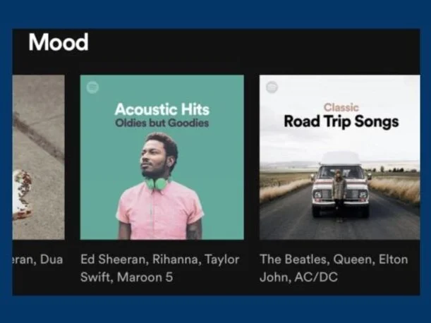
Spotify
My second was to follow the Spotify example to clearly label curated playlists with what kind of music a user would expect to find in each playlist.
-
Pandora
My final and most important take-away from this analysis was to keep the design simple and use terms users would clearly understand like Pandora did.

Target User Survey
I made a 20-question survey about users’ current listening habits. I sent out the survey through social media groups and used hashtags to target users 18-24. The dataset among this group was small, so to get a better sample size, I used data from participants aged 18-34. I found interesting data points by looking at these groups as a whole and as distinct groups (18-24 and 25-34).

Among users who streamed music in the past 30 days, a whopping 61% of target users use Spotify at least once per week.

Users purchased paid subscriptions in order to get premium features like:
Ad-free listening
Offline listening
Song playback & skipping
Users in the 25-34 year old demographic reported spending more money on music subscriptions than 18-24 year olds. So to retain users as they aged I created a two-tiered subscription model illustrated here.

Empathy Map

Personas
Research Summary
I summarized the findings of my research in a one-page document and presented my findings to key stakeholders before starting the sketches and wireframes of the redesigned product.
Define Phase
User Flows
I created three flows a typical user would go through using Sonic North.
Design Phase
Lo-fi Prototype
I sketched and made wireframes from these three user flows to sketch to user test the flows with real users.
The first flow sketches guide users through onboarding and subscribing processes. In this process, users sign in or sign-up for the app and have the first opportunity to subscribe to the paid service.

I created wireframes after I sought feedback about my sketches from other designers. The wireframes pictured below show the flow of a user creating a new playlist and adding songs to it.
Testing & Iteration
I recruited users from social media groups and used hashtags relevant users might follow. I wrote a screener survey to screen for age and for frequency the participant streams music. I scheduled 5 users to participate in moderated remote usability testing and also got 7 users to do an unmoderated usability test. To conduct the unmoderated usability testing, I used maze.co. Each participant went through the user flows.
These are the results for the first user flow-signing up for an account.

The success rates for users completing the listening to music flow.

Finally, these are the results for the flow asking users to create a playlist and add songs to it.

First Usability Test & Iterations
Based on this round of testing I modified several things in preparation for the high fidelity screens. In the initial design users needed to sign up for a trial membership to continue with the onboarding process.
Several users in testing commented how they would rather choose to subscribe or skip it. In the High Fidelity Screens I created a skip button which limited the features users could use unless they signed up for the free trial.


I created ways users could subscribe later in the app as well. In the initial wireframe, this was an entire screen. To improve the user experience, I made it a small banner as a gentle reminder they could subscribe rather than an annoying interruption to their task flow.
Many users also said the verbiage for choosing music to fit their mood was confusing. I changed this button to more clearly describe what the button did. This significantly improved users ability to complete this task in the high fidelity part of usability testing.

High Fidelity Prototype
I created a high fidelity prototype based on the user flows and wireframes I had created. I added locks next to certain features in the demo version to show users they were available only with a subscription. I also made a mini player shown on the bottom right screen below.
I also animated several screens to help users know when they successfully liked a song or followed a playlist.
Second Usability Test
I tested the high fidelity prototype with one user live in a guerilla test. I also conducted 7 unmoderated usability tests. In this round of usability testing, I rewrote the tasks to prevent my verbiage from leading the user. Below are the results and modified questions for each task.
I saw the bounce rate was higher for this task, but realized it was a setup mistake where I did not set up a path to skip the trial sign-up.
Users found a flow problem I had not seen earlier. They were not sure their playlist had been created. I reworked these screens by adding a button for users to press when finished and a confirmation screen to confirm users’ playlists were created.

Many users said it was difficult for them to pick just one mood to describe how they felt. They also did not want to worry about choosing old or new music, they would rather just start to listen. In response to this I iterated on this idea and refined this screen to check boxes instead of radio buttons and removed the option to choose old or new music.

Reflections
As I completed this project, I learned to be more generous to myself with deadlines and to account for “real life” rather than what I thought I could do. I also learned how to pivot in the middle of a project to account for outside factors-in this project it was being able to get enough users in the key demographic to test it with fidelity.
Unmoderated usability testing gave me significant insight which I did not think I would receive from such a testing model. I learned that appropriate questions and well-written tasks are key to gaining as much insight as possible for useful insight. Next time I would recruit much earlier for usability testing and grow my network to include more people from this demographic.