

ClassVroom Works
Introduction
Video conferencing software has been around for years, but their primary users have been businesses. Schools have been able to patch together a series of programs to facilitate learning with current video conferencing tools, but in today’s educational environment of distractions and off-task behaviors, teachers and students need a tool which reflects classroom norms. A tool to assess learning, facilitate meaningful interactions, and provide users with a seamless virtual learning experience.

Roles and Responsibilities
I was the UX Researcher and UX Designer for this project creating wireframes and prototypes for the product and conducted usability testing for this product.
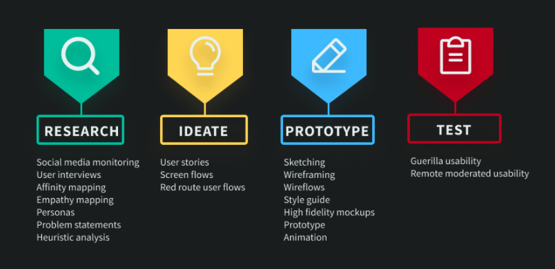
Discovery Phase

Competitive Research
I wanted to learn standard features in video conferencing platforms, so I analyzed competitors’ features to understand industry standards and how they already met classroom needs.

Teacher Survey
I wanted to learn how current features should be adapted for school users. I asked several teacher social media groups how their current software could better facilitate learning. I coded and tallied responses to find trends of teachers’ needs.
User Interviews
I also wanted to learn how teachers actually run virtual classrooms. I screened for teachers who taught different grades and subjects. I wrote 12 guiding interview questions and interviewed each participant about their pain points when teaching in a virtual classroom. I made an affinity map to group key insights from the users and to find patterns from their experiences.


Affinity diagram and empathy map of trends found in user interviews.
Define Phase
Problem Statements
I wrote four problem statements of teachers’ biggest pain points with virtual learning to design the MVP.
All Users need a solution that reflect classroom norms.
Students need to meaningfully interact in a virtual setting.
Teacher need tools to assess student learning in live instruction.
Teacher need room management tools for more seamless learning.
Personas
It was clear I would need to design a 2-sided platform to address teachers’ needs and students needs, so I made two personas to highlight each user groups’ needs and pain points.


Heuristic Analysis
I completed a heuristic analysis on the major competitors in the educational space. The analysis focused on three specific areas of Jakob Neilsen’s principles for user interaction design.
Match between system and real world
Consistency and standards
Aesthetic and minimalist design
User Stories
I developed user stories based on the most common needs of teachers and students knowing I would design separate screens for student and teacher users. I wrote red routes for users most common use cases.


Design Phase
Paper Prototypes
I sketched screens from my red routes and guerilla tested them with five teachers using two of the red routes. All five teachers were able to complete the activities, but there were several design flaws with the initial paper prototypes.


Wireframes
I created wireframes in Figma based on the initial sketches and iterated based on the feedback I received in the guerilla usability tests.
I simplified the select meeting screen and added a popup work confirmation modal.

Wireframe of “Meet Start” screen.
I disabled the general meeting options and made a larger back button.

Wireframe of individual meeting screen.
I created wireframes for the third red route which I based on a student use case.

Student start and meeting screens.
Wireflows
After completing the wireframes for all three red routes, I created wireflows to map how users would move through each red route.
The first red route mapped how a teacher would assign work for a class meeting.

The second red route showed a potential path for a teacher running a class meeting.

Finally, the third red route illustrates a student attending a class meeting.

Brand Platform
The mission of ClassVroom Works is to provide a positive K-12 virtual learning experience. Our brand must first build trust with our clients because of the negative memories many people had with virtual schooling during the COVID-19 pandemic.
I chose colors in our products which reflect trust and calm. I made a mood board to reflect the delightful experience users should have and began thinking about the UI of the platform as well.

Mood Board for image and UI inspiration.
Style Guide
I chose a dark color scheme because users who participate in virtually learning spend much of their time on a screen. Dark color schemes help reduce eye strain for users. I also ensured colors were accessible and contrast ratios were AAA.

I selected icons and emoticons which would be familiar to both literate and pre-literate students.

Prototype
For the high-fidelity prototype, I used feedback from my guerilla testing to revise several key screens. I explored the size and placement of different icons in the meeting screen and tested their efficacy with users in usability testing. I tested the student screen with teachers based on their own students’ experiences with virtual learning.
Testing & Iteration
I conducted remote moderated usability tests
I wrote a series of three tasks and script to ensure test validity.
I conducted second set of user tests with different users based on first round of tests
In the first set of tests, users had trouble with some features. Many tried to click on users’ microphone icons to mute/unmute them rather than click on the ellipses menu.

In the second prototype I gave users the autonomy to mute or unmute from both the menu and the icon. Teachers also wanted to be able to lock or unlock features students could use-the chat, screen share, etc. I added this feature and tested with users in a second set of remote moderated usability tests.
To standardize the user interface and build trust with users, I redesigned buttons in individual and group view screens.


Changes made between usability tests on individual meeting screen.

Design changes to student view.
I iterated on sizes and shapes of the cards to give a uniform and predictable user experience.


In the original design, there were only three sections of the manage classwork screen.
Users said it was important for them to be able to view assignments they have already assigned, so to solve this problem, I added a schedule card to the manage classwork screen.

Original “Assign Classwork” page design.

Manage classwork screen with schedule card.
Conclusion
Designing a video conferencing app that is intuitive, comprehensive, and simple to use is challenging. It was important for me to get feedback from teachers across grade levels and subject areas to build a platform which could be used in the K-12 setting. When I redesigned the app, it was much more intuitive for users to use.
As I worked with the developer on the functionality of the app, I learned the importance of specifying the colors of icons-especially if the colors changed. I also learned basic HTML coding so I could better communicate with the developer on how the project should function properly.