

Remote Work Mobile App Design Sprint
Remote work has become common for many workers. Although workers work from home, many must travel to meet clients or coworkers, often in unfamiliar areas. PostUp exists to help remote workers find good locations to get work done or hold a client meeting. Reviews and information found in this mobile app are specific for workers’ needs.
Problem Statement
PostUp has found workers often ask other users for public places ideal for remote work. PostUp wants to design an app to help users easily find already existing places where they can do quiet work, take phone calls, and have quick meetings with clients or coworkers. They want to charge users a monthly fee in exchange for the information.
Goals
The goals of the design sprint were:
Develop a mobile app for remote workers to find pre-existing locations where they can do their work.
Create an onboarding process to let the company charge a monthly subscription in exchange for location information.

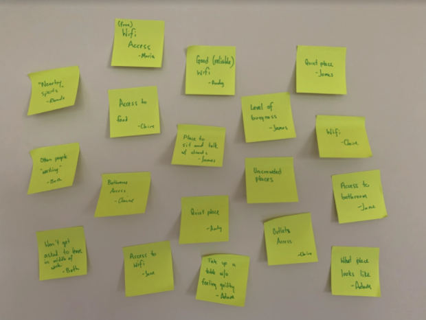
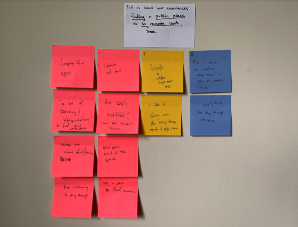
User Research
I took the information from my client and mapped out common themes from users. I listened to a user interview and organized those ideas into positive experiences, negative ones, and key insights.
User Persona
The company provided me with the typical user’s behaviors, frustrations, and goals. The information to the left is a summary of the user persona.

User Journey Map

After mapping several user journeys, I chose the map a typical user would follow. The map below is the journey through which my story continues.

Lightning Demos
I completed lightning demos using Airbnb, Open Table and Google Maps. Each was not specifically what I was trying to create, but inspiration which would influence the design of the final prototype.


Ideation
I completed a Crazy Eights sketch based on the 2 most important screens. The top line focused on users’ search screens showing a map of possible workplaces along with a preview of each similar to Airbnb app features.

The second set of ideas focused on the details page users would go to find out more details about the place.

Solution Sketch
Based on my brainstorming sketches, I decided the center screen was most important. It showed a map of places near the user and a preview card for each place. Preceding the center screen was a search map. Following it was a detailed description of the public place.


Storyboard
After mapping out the most important screens of the user flow on day 2, I storyboarded the entire user flow. I also worked in the business goals during this stage of my process.


Prototype Flow
I developed a prototype to use for testing. Pictured below is a sample screen flow through which a typical user would progress.

Onboarding

Location Search

Usability Testing
For usability testing, I recruited five remote workers from social media groups and friend circles. Responses from usability testing were codified. Results to the left show the percentage of issues users reported.

Usability
Users reported the most trouble with actually using the app (52.5%). Several users said things like:

Commenting on the place icons, another users said:

These issues as well as others need to be addressed in future iterations of the app before it will be ready to launch for use.
Familiarity and Accessibility
Several users commented this app needs to work like others with which they are familiar. Some users said things like:

One user brought up several accessibility issues with the original design, specifically the color of the two pins and the difficulty it would give colorblind users. These icons also differentiated only in color, but to be accessible need to have at least one other difference.

Features and Cost
Users said a dark mode would be useful. Another said the description on the preview card changing as the level of business changes throughout the day would also be a benefit of this app.
Business goals wanted this app to be a subscription model. Users would expect more value for the subscription. They would more likely use the app if PostUp partnered with these local vendors with coupons for PostUp users.
Lessons and Conclusions
Feature Familiarity
While researching in the lightning demos, I should have noticed functions within the app researched. Several users in testing tried to click the pins to find places, rather than using a carousel scroller.
iPhone Native Icons
The share symbol I selected was confusing for some users, several said they were used to the square with the arrow symbol with iPhones.
Onboarding
The onboarding was simple, but the confirmation screen should have been a modal or animation that took users directly to the home screen.
Basic Information
Users felt the business address should be prominently displayed on the page, rather than just including a map and directions.
Accessibility
The colors I used to show locations were not accessible for all users and some icons had complex designs, which confused several users in testing.
Final Thoughts
The design sprint proved to be a viable way to develop this product and with minimal fixes will be ready to launch in the near future.