

Houzskool - Brand Platform & Style Guide
Overview
Houzskool is a pre-seed startup SaaS company for homeschooling parents. The company is currently developing a learning management system for homeschooling parents—specifically religiously conservative women with school-aged children. to manage not only curriculum but various regulatory requirements homeschooling parents must submit to state governments. The developer has been designing screens and hiring contractors to design screens for this project, but has found each design to be slightly different. The purpose of this project was to build a style guide and early design system upon which to base the product and to showcase it in several redesigned screens.
Roles and Constraints
I worked with one other designer and a developer. My role for the project was to create a design system and showcase its use in a previously built screen with which the client was not satisfied. Wireframes and several high-fidelity screens had already been designed and developed prior to when I joined this project. My part of the project was time capped at 40 hours. I was given little guidance in the direction of the design system with previous design files given to me by the developer.
Process

Product Research
I was given marketing research which had been previously conducted on the project. I analyzed this information to determine what information could be directly applied to how a person would use this software. Because of time constraints and no access to the functioning prototype, I was not able to conduct user testing with the current product. I also analyzed the main sections of the site and learned the user flows already developed for each section of the site.

Design Planning
I met with the other designer and developer for this project to learn more about the problems the company was tackling currently. I learned the developer had designed several pages and had hired different freelancers to design other pages on the site. The developer expressed frustration over (1) the consistency between different screen designs and (2) the flow of the two sections of the site. From this meeting we developed a list of 3 goals we needed to accomplish to deliver this project:
Create a design system to ensure brand consistency and provide a framework for future designers.
Improve the flow of the course creation process.
Improve the design of the compliance section of the site.
I was in charge of delivering the design system and improving the course creation process.

Design Phase
I researched design systems and style guides from major companies. I analyzed the differences between the style guides and design systems. The developer was using react to code this product. It is because of this and the needs for the product to be designed for a desktop platform I modeled my design system off of Material Design by Google. I organized and categorized priorities for the design system. I did this to maximize goals for the MVP and because of the time constraints of the project:

I was surprised to learn there were 8 different primary colors used across the app and marketing sites. For a brand to build trust and give users consistency I needed to make a consistent color palette. I made sure to prioritize this when I created the design system.

It was important for me to be sensitive to the branding desires of the client, but also to reduce the number of color options to build a more cohesive brand and product. After I labeled all of the colors used in the design system, I used the material design color picker to label main, dark, and light brand and indicator colors. I also wanted to ensure the site was accessibile, so I defined “on” colors that were at least AA (and where possible AAA) compliant according to the WCAG 2.1 standards.


I included a separate annotation page for colors to clarify which color combinations would be accessible and which color combinations should not be paired when designing future screens.
Accessibility was also a major reason for using a separately designed text box and dropdown section for the design system. I wanted to ensure screen readers were easily able to work through the site, so I designed labels outside of text boxes and icons outside of the text box itself to maximize accessibility of the site in future screens.

I created the design system in Figma. I defined the styles for all of the colors, icons, fonts, and assets to maximize efficiency for both designers and developers.
As I completed the design system, I sought out feedback from the other designer on the project. The other designer pointed out how several sections of the design system left room for interpretation. To solve this problem, I wrote and created examples of good and bad uses of the design system to clarify any questions about how to use the system.


Course Creation Flow
Before I showcase how I used the design system in designing a screen, I want to back up to the screen itself to look at the usability challenges and issues I found in it. The user of this product was defined as a mother in her 30s and religiously conservative. The screen had already been created, since there was only one developer I wanted to minimize the time needed for them to code what was already done, so I used the original design as inspiration for my redesign.

First, I analyzed each of the sections of the add course screen and its various states.


The biggest usability issues I found were with accessibility, many which would be addressed with the new design system, and the verbiage and flow of prompts and submenus.

I started my redesign by sketching the flow through which a user would go to successfully add a course to their dashboard.

I decided the flow would better serve the user by first beginning with the largest idea-the name of the course because in the mind of a teacher, a course is everything taught within it, most courses use a curriculum as a primary resource, so I decided to reverse the order of these two prompts.

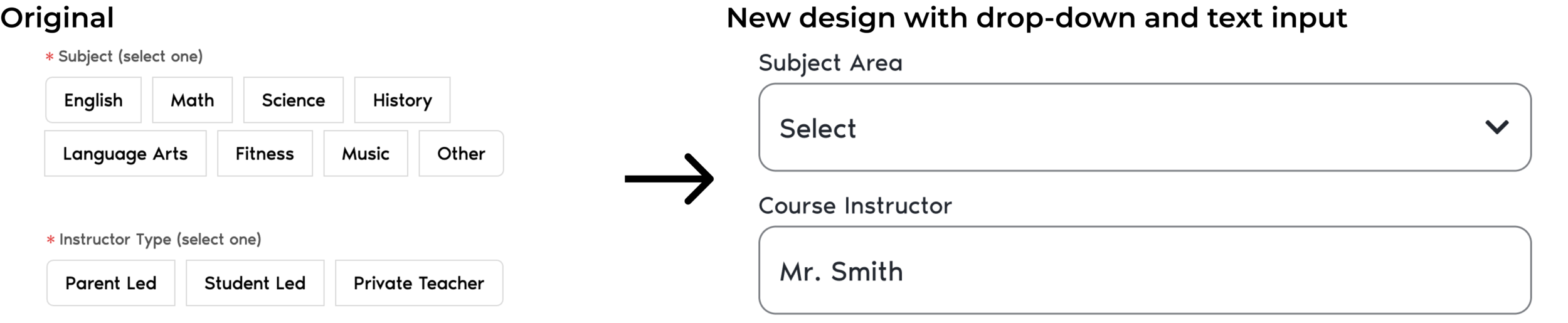
In the original design, the design used chips for three prompts. I decided to change these in three different ways. I chose a drop down for the subject area because school subjects can be very broad or very specific-a drop down menu will allow adequate space to list all of these subjects without taking up a large amount of screen space. Using an input text field allows the user to specify the name of a teacher in cases where a teacher is an individual other than the parent or student.
Using a drop down for specifying the occurrence of the course follows the patterns of the rest of the prompt screens. I also chose to change the input for a custom occurrence from a text box to a calendar view because a course occurring less than once every two weeks will in most cases only have a few meeting times, a calendar will help users visualize the dates.


Deliverables
I thought it important to add explanatory illustrations and to explain what kind of information should fill each empty section. It differentiates it from the filled state, which is in a list view. This is the empty state of the screen redesigned.

Below is a sample of the way the prototype works.

Lessons and Takeaways
One of the biggest challenges I faced in this project was the limited time and lack of in-depth customer research. I was given limited market research done with typical users. This research was limited because its interview questions did not probe a user further, but rather stuck firmly to the same questions for each person interviewed. The research also only included notes (not transcripts) collected, I was not given any audio or video recordings to help me read users’ body language or verbiage common among users.
If I were to redo this project, I would ask for more time to better understand users of this product. The research information I received was market specific, it would have been useful to do additional research on users to understand pain points with the homeschooling management software parents currently use. I would expand the scope of this redesign to include the screens coming before it. By redesigning the course dashboard, I believe I would better be able to design the add course screen to more cohesively flow with the rest of the section of the site.