
Assistments Report Redesign

Summary
This case study is about a redesign of the assignment report in ASSISTments. I discuss problems that users had with the previous design, such as unclear table navigation, data visualization challenges and limited-use components. It details solutions implemented in the redesign: fixed table navigation, support for new item types, and a more precise data visualization. Finally, I share the reactions from users who tested the new design.
Introduction
ASSISTments provides detailed reports which highlight where students’ are struggling to understand the content. The platform has recently introduced new item types which present challenges to accurately representing the problem information in the assignment report. The redesigned report offers deeper insights into ‘in the moment’ student thinking while also enhancing usability and accessibility.
Problems with Report
Unclear Table Navigation

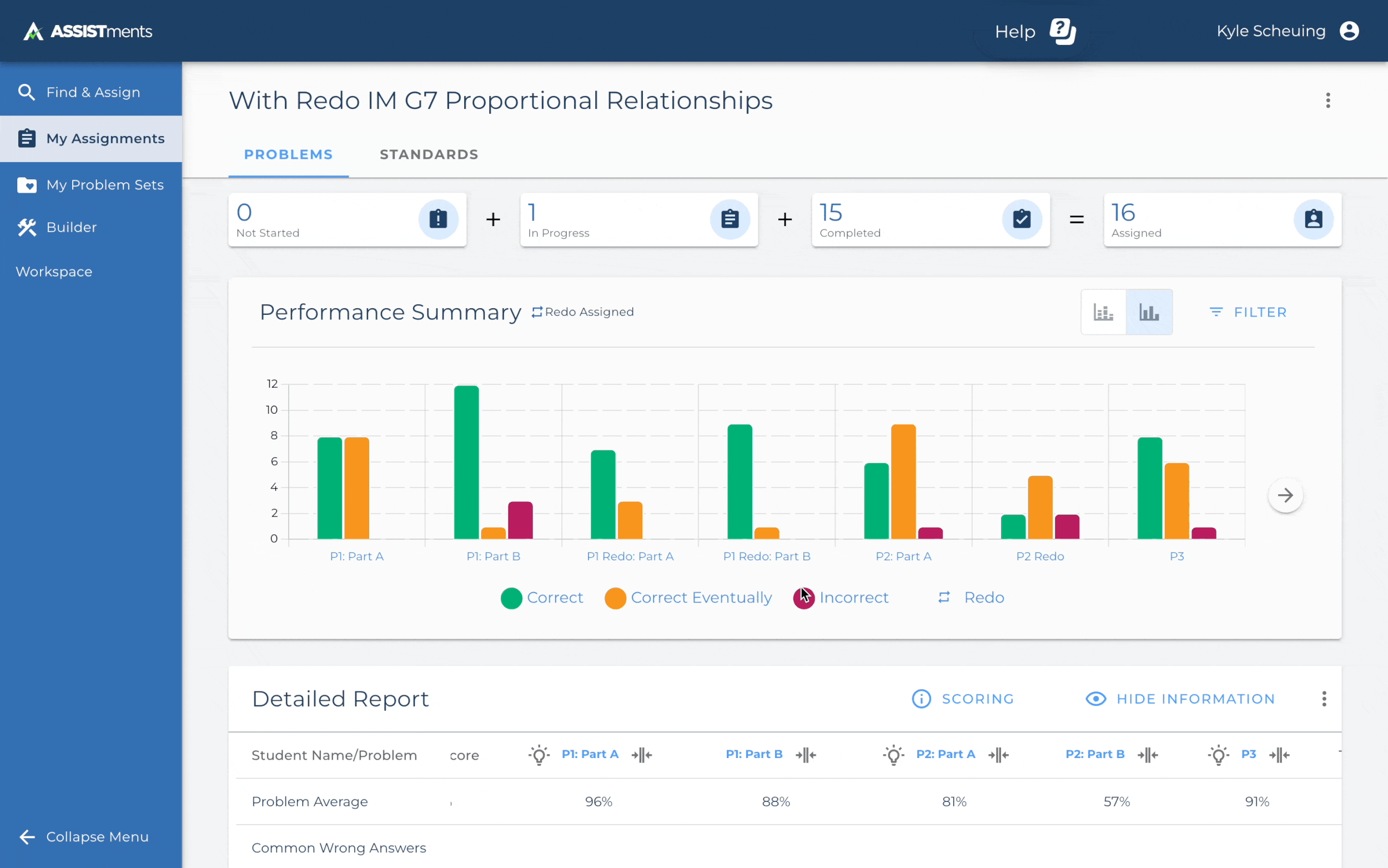
The report provides robust information of students’ progress on their assignments, but navigating the detailed report is a pain point for our clients. They want to consistently see key information about each problem, but when users scroll, header rows scroll with the rest of the page, making it difficult to track which problem they are looking at. Many users reported during interviews how much they use the graph to show them where they need to look in the detailed report.
Limited-Use Components
The assignment report shows detailed student responses and how to address misunderstandings, but the design is inconsistent with Material Design. It uses two different methods to present similar information, making navigation and understanding difficult. The popup menu for student answers fails to clearly communicate context when multiple answers are involved.
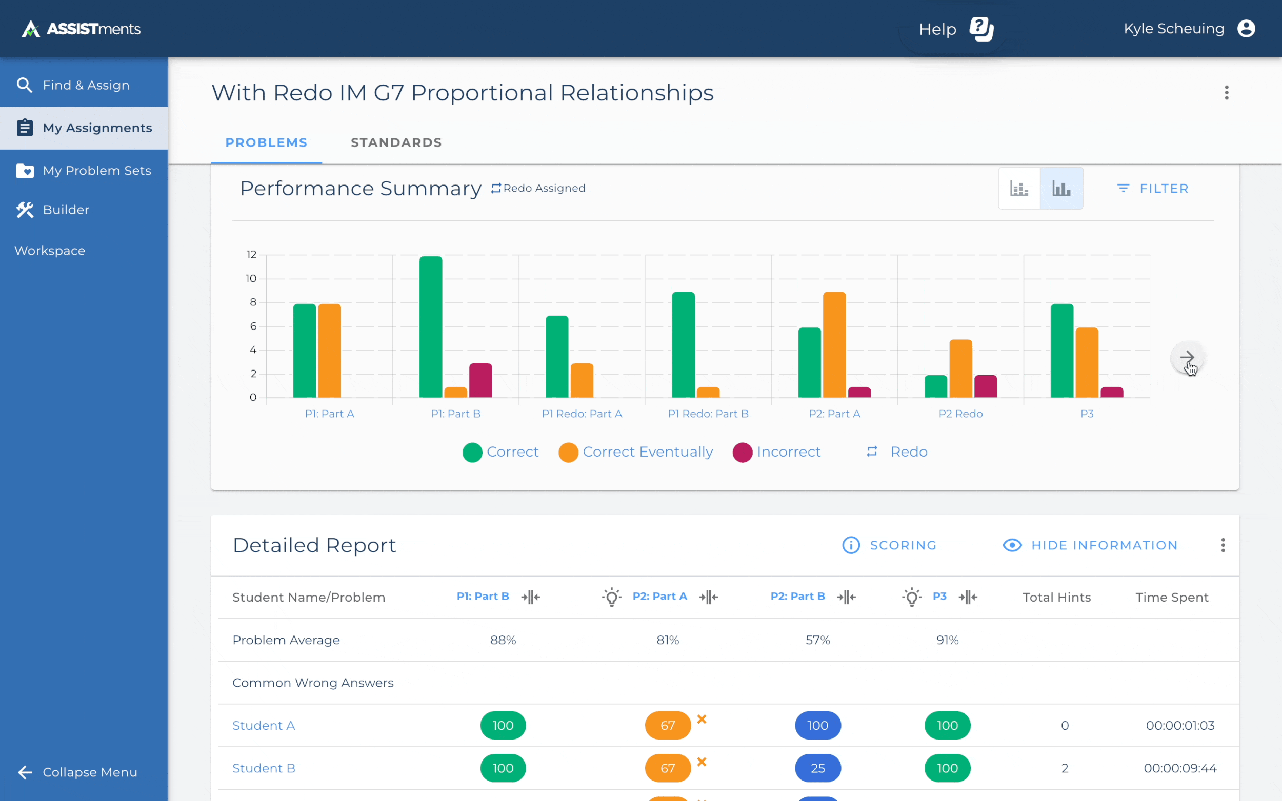
Data Visualization Challenges
The current data visualization uses a bar graphs to compare student success for each problem. But, because there are often many problems, the resulting user experience becomes noisy and forces teachers to parse through the data to learn which problems students are struggling on and where they need to focus their instruction. This takes extra time for users to process, which hinders a speedy workflow.
Solutions in Redesign

Fixed Table Navigation

We decided to anchor the detailed report to the bottom half of the screen. This meant three things…
It allowed users to see the header elements like problem numbers and common wrong answers
Users reported they use the graph and report in tandem, so we prioritized keeping the graphs and reports visible as they scrolled other information
An option to expand the table to let a user compare more information at the same time.
Support for New Item Types
Our new problem types support multiple inputs in a single problem. Since our current problem types only supported one answer, we had rethink how we showed students’ answers in a way that provided context with the problem. We scrapped the side panel and menu that currently gave this information into a more robust modal. This allowed us to…
Show student thinking more clearly by integrating answers, attempts and the problem into one card
Give our users a new way to navigate through the detailed report—either by problem or by individual student using a new remote control like navigation
Integrate the currently separate open response scoring screen into the assignment report

Stacked Bar Graph Performance Summary
Because the performance summary was popular among out users, we wanted to keep a similar graph and experience. We decided to repurpose it as a stacked bar graph. This change let us continue to show where students struggled on each problem and show more problems on the graph at once. Since we already had the original bar graph built, we decided to keep it as an alternative graph so users could switch back.
Reactions and Conclusion
Usability Testing
This was a major change to a popular feature in the application, therefore we conducted usability tests with a large group of users. 90% of users were overwhelmingly excited about the new changes to the assignment report. We interviewed 10 users, iterating half-way based on the feedback we had received from the first five users. Based on their and other internal stakeholders’ feedback we revised a few things about the final designs:
The left and right arrows to scroll between problems were moved to be part of the remote control
A problem info button was added to the remote to shortcut back to the original problem information
Responses and Attempts were put into a card and attempts were tabbed with each attempt summarized
Conclusion
The implementation of this project has been broken up into stages because of technical constraints—primarily the delay of new item types being launched. Currently the performance summary has been added to the old report and implementation of the new assignment report is planned for Q1 of 2025.